Even when the schedule changes, we don't rebuild the charts
Replaced the work of hand-collecting schedule tables and building charts in Excel with a structure that collects them automatically and shows them directly on a screen. The work that used to be redone from scratch every time the schedule changed went from 4 hours or more to within 1 minute.
Manual working time
Before
4 hours or more
After
Within 1 minute
Background
The schedule changes every week. To see how much airtime your own content got on which channel and how competitors moved, you have to keep watching the schedule tables.
What we saw on site
The person in charge was hand-collecting the schedule tables and building each chart by hand in Excel. Whenever the schedule changed, the same work was redone from scratch. To compare with a past period, they had to find the files made back then and line them up again.
The problem we defined
Automating only the collection piles up numbers but doesn’t make them readable. In the end, someone opens Excel again. Collecting, viewing, and reporting have to be connected into one flow before human hands actually drop out of the work.
What we built
The result is two pieces: the collecting side and the viewing side.
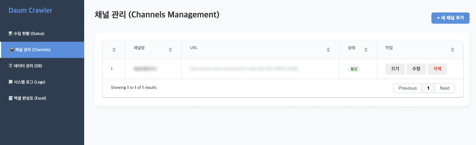
- Collection management screen — the person in charge registers which channels to collect and turns them on and off. Collection status and execution logs are checked on the same screen, and schedule tables are received as Excel files. Adding channels doesn’t require calling a developer
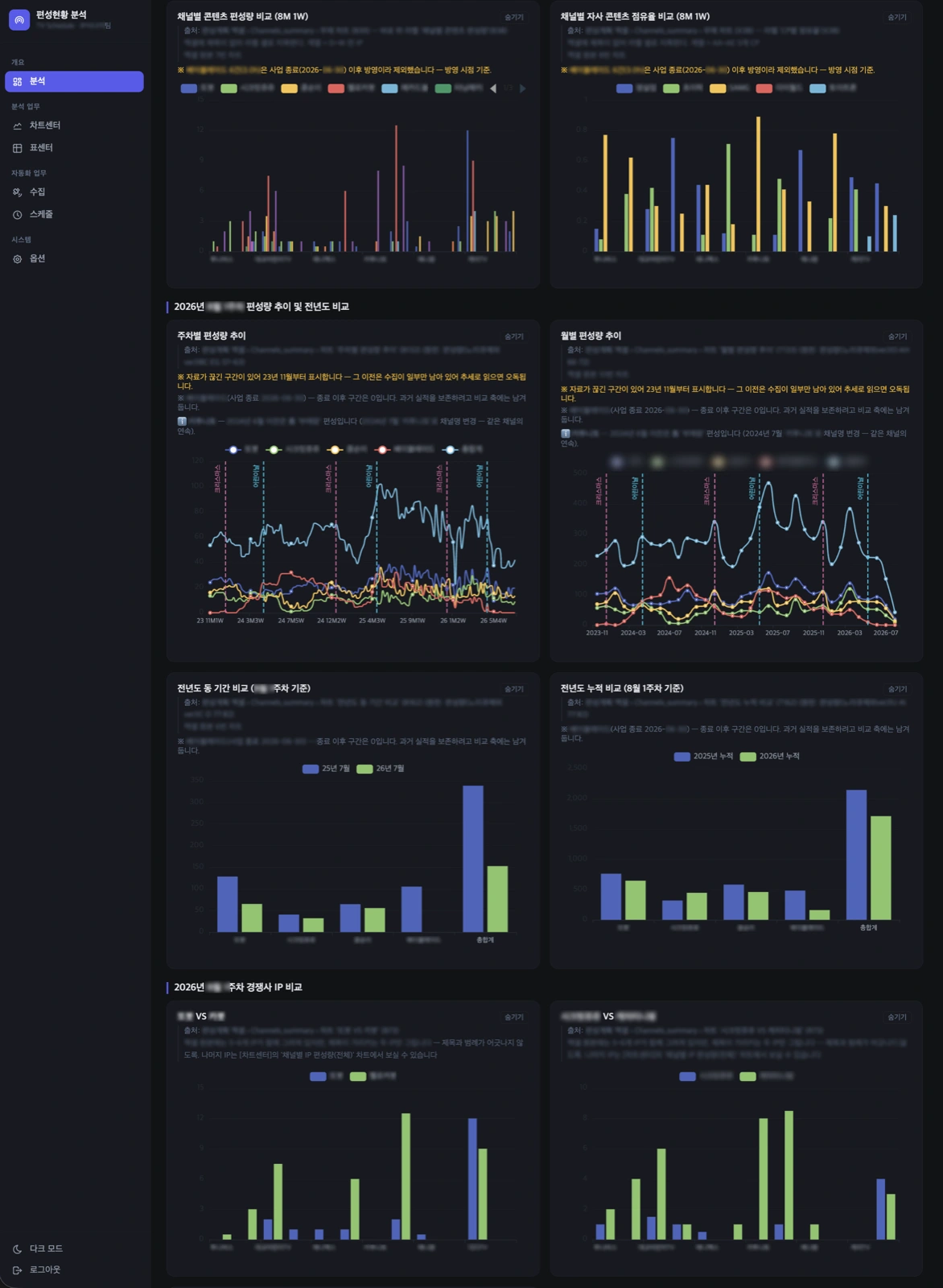
- Analysis screen — weekly and monthly schedule volume trends, year-over-year same-period and cumulative comparisons, own-content share, and competitor IP comparisons on one screen
This is the actual delivered screen.
Before automating collection, we first turned the person in charge’s selection criteria into rules. Which items to take and which to discard existed only in their head, not in any document. Automating in that state would have produced results nobody could trust. That the requests were many and demanding actually helped — the more concrete the criteria, the more of them can be turned into rules.
Result
Built and delivered in 2 months. The process of hand-collecting schedule tables and building charts in Excel is gone, and the person in charge opens the screen to check the current schedule and changes versus past periods at a glance.
Other work built the same way is collected at web data collection.
Other work on the same topic is collected at data analysis.
Cost by collection scale and difficulty — Data collection pricing
Sources
Korean expert platform verified transaction review (Yoon OO)