An analysis tool that shows thousands of research comments split by topic and sentiment
Video comments gathered by search term are grouped by topic, with a positive/negative distribution alongside. How many topics to split into is decided by the researcher on screen. It was built so the researcher can change the criteria and re-run it themselves.
Understanding comment topics
Before
By skimming with the eye and guessing
After
By per-topic, per-sentiment distribution
Background
Collecting YouTube comments with a specific topic as the search term yields thousands of them. What the research needs to address is how many strands of stories are inside, but reading them from start to finish does not reveal those strands. After reading a few hundred, you start guessing at the rest.
The problem we defined
Tallying “what percentage is positive” alone was not enough. You have to first split by what is being talked about to know where that sentiment is aimed. The scope of the problem was keeping the work of splitting topics and the work of counting sentiment separate, and then viewing the two overlaid.
And the researcher had to be able to change the criteria and re-run it themselves. How many topics to split into is not a value with a correct answer but a value decided while looking at the data. If that value were hard-coded, they would have to call us every time they wanted to try a different one.
What we built
- Topic modeling — splits comments into topic groups. Topic count, training iterations, and top word count are changed directly on screen
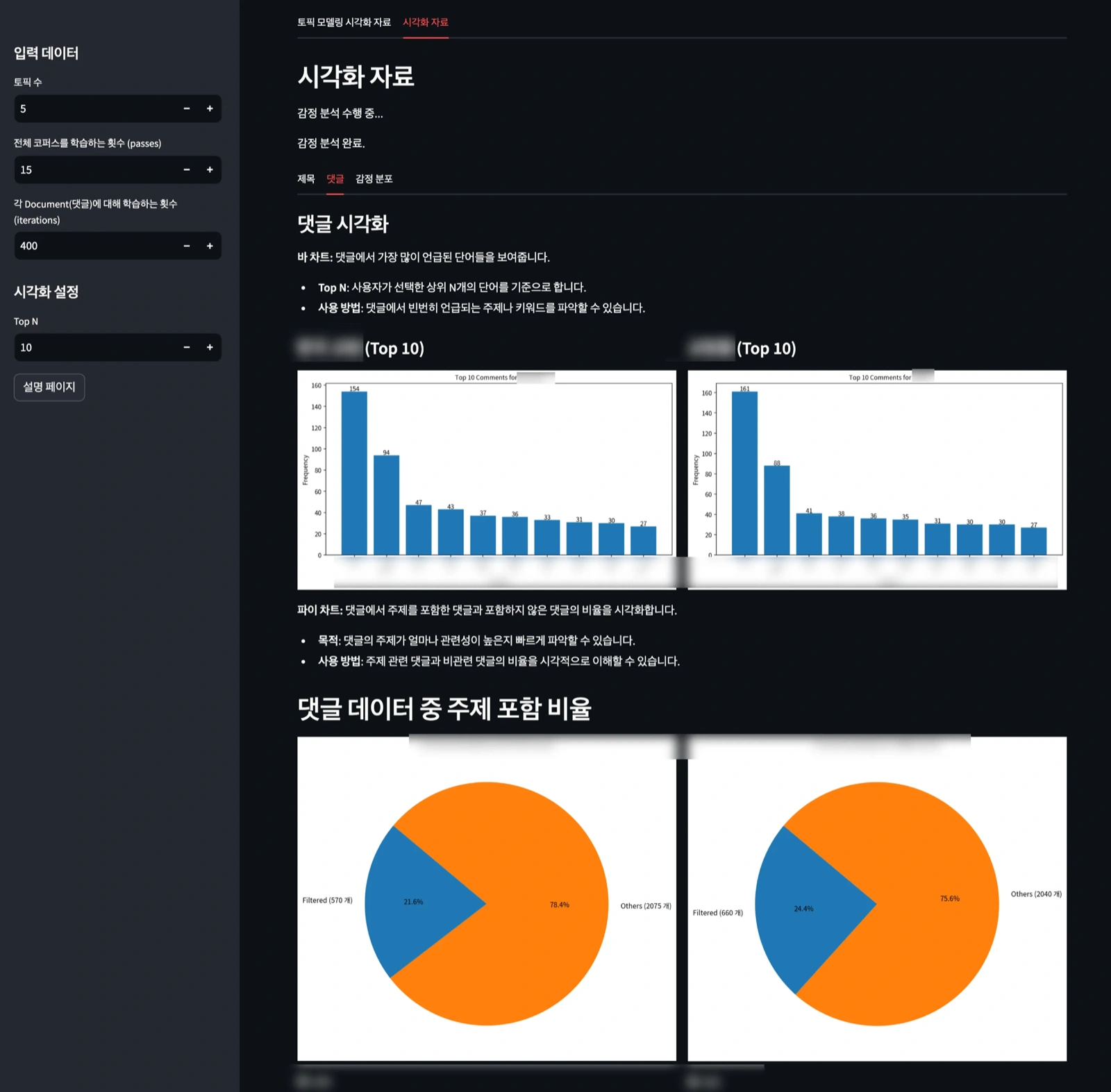
- Frequency visualization — shows the top 10 most frequent words as bars
- Topic inclusion share — shows as a pie what percentage of all comments contain the specified topic
- Sentiment distribution — shows the positive/negative ratio alongside
Results
The thousands of comments gathered per search term come out organized into per-topic groups and sentiment distributions. The two on the screen each represent 21.6% and 24.4% of all comments that contained the specified topic.
Re-running with changed criteria is done by the researcher themselves.
Other work on the same topic is collected under data analysis.
Other work on the same topic is collected under applied AI.
Sources
Running screen of the delivered tool